Work / Cosmetic Dental Clinic
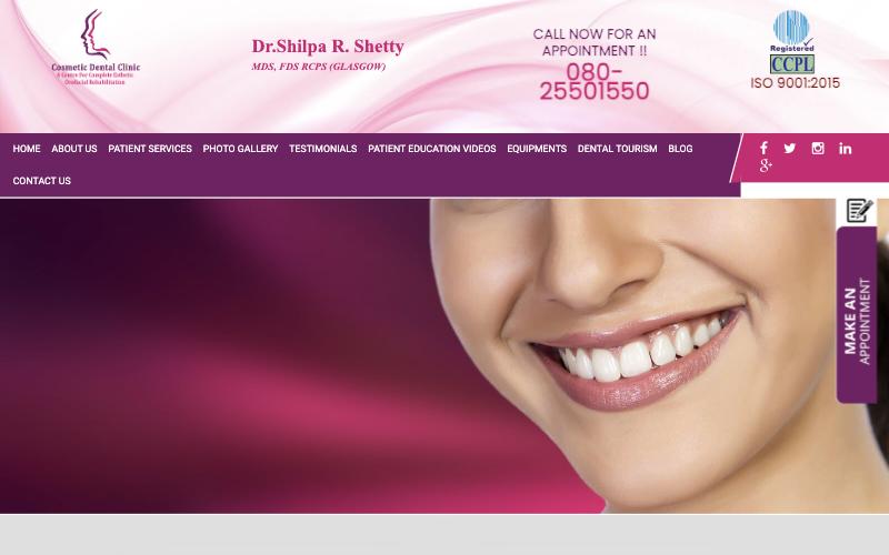
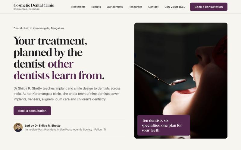
The clinic's director teaches implant dentistry to other dentists. Her old website sold a stock-photo smile. The new one leads with what makes her practice different.
BeforeAfter
Homepage at 1280px wide. Drag to compare. The hero photo is a licensed stand-in until the clinic's own shoot.
The problem
Dr Shetty is the Immediate Past President of the Indian Prosthodontic Society and a Fellow of the ITI. She teaches implant and smile design courses to dentists across India. On the old site, that was one line of small italic text under her name.
Everything else said "generic cosmetic clinic": a stock smile, a pink gradient, an ISO badge that had expired, doctors who had left, and placeholder text on inner pages. A patient choosing where to get an implant had no reason to pick this clinic over the one next door.
The job was not "make it look modern." It was to make the clinic's real advantage visible in the first five seconds.
Research
Before designing anything, I opened 19 clinic websites that win high-fee patients in Bengaluru, Mumbai, Delhi, London, Dubai, Singapore, New York and Zürich. For each one I read the actual colours and fonts from the live page, not from a screenshot.
They fell into five visual groups. Only one fits a specialist-led practice in India.
| Look | Who uses it | How it reads | Verdict |
|---|---|---|---|
| Warm ivory, editorial serif | Perfect White Smile (Beverly Hills), Opal (Mumbai), Dentalis (Singapore) | Calm, expensive, considered | Use |
| Navy specialist | Marylebone Smile Clinic (London), Dazzle (Mumbai) | Trustworthy, a little corporate | Borrow the trust row, not the colour |
| Black and white editorial | Apa Aesthetic (NYC) | Fashion brand | Too cold for families |
| Black, gold and marble | Le Denté (Dubai) | Jeweller, wedding invite | Avoid |
| Mint and dental blue | Most mass-market clinics | Cheap and cheerful | Avoid |
The clinic already had a plum logo. No competitor in Bengaluru owns that colour, so I kept it and deepened it to aubergine, on warm ivory, with a brass trace.
What I changed
No "10,000+ smiles" bar. Numbers nobody can check look made up, and they signal volume, which is what a high-fee patient is paying to avoid. The hero names Dr Shetty, her role, and her fellowship instead.
Patients don't search for "prosthodontics." Each treatment starts from what's wrong: For missing teeth, For bleeding or receding gums. Each page then names the specialist who does the work.
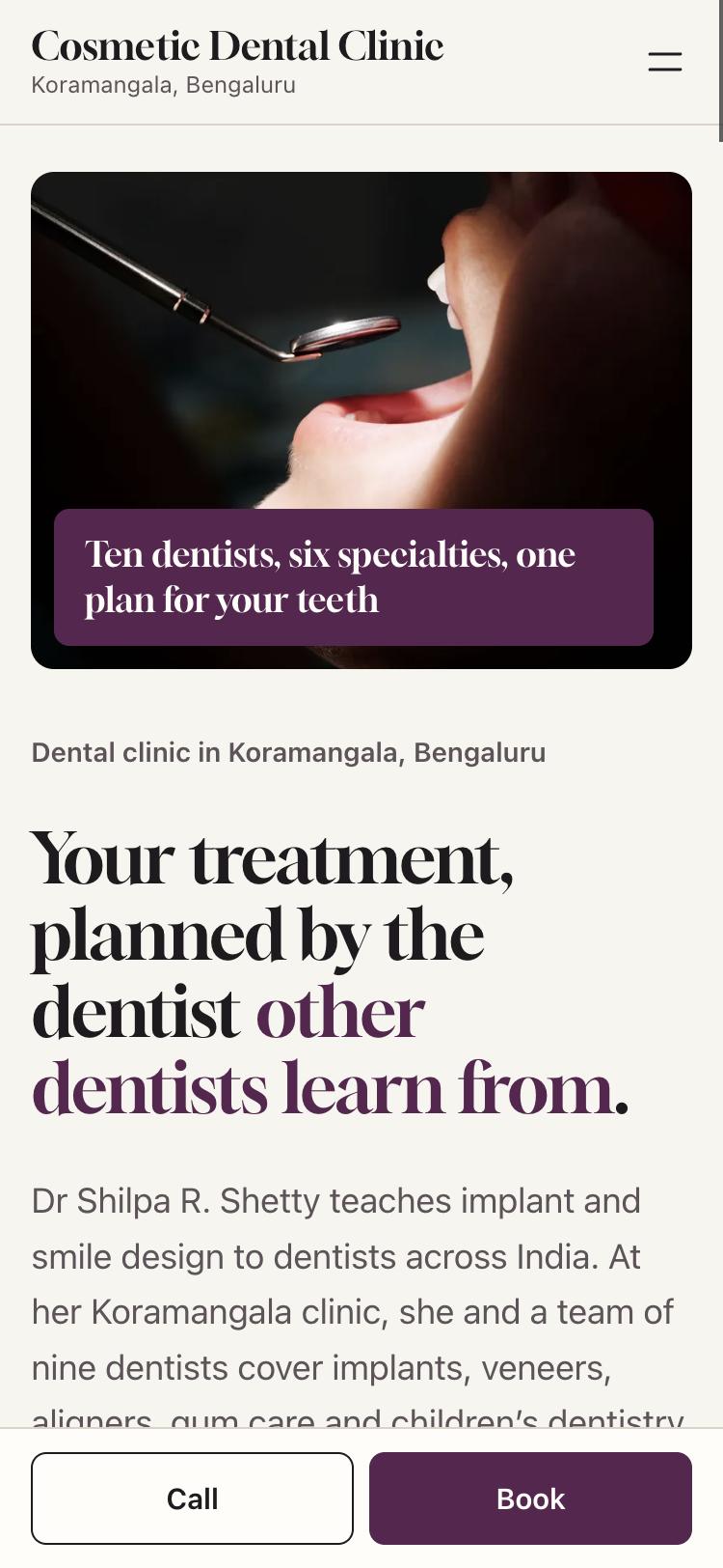
The old site had a phone number you couldn't tap and an appointment tab stuck to the edge of the screen. The new one has one "Book a consultation" button, plus a Call / Book bar that stays at the bottom of the screen on phones.
I removed the expired ISO badge and every claim I couldn't confirm, such as "best dentist" and equipment the clinic may no longer have. Each one stays off the site until the clinic confirms it in writing.
On a phone
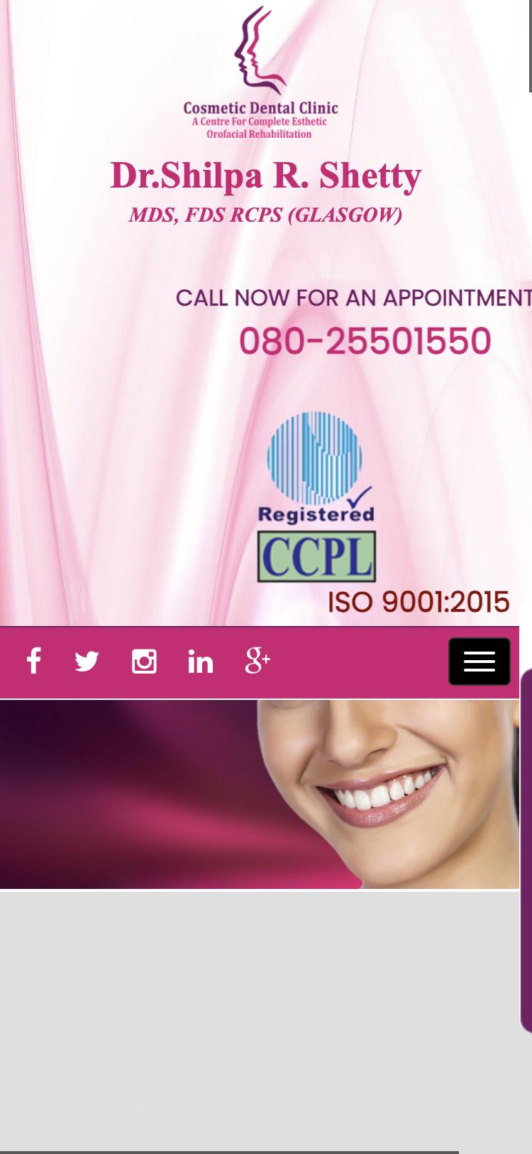
On the old site, a patient on a phone had to scroll about two full screens of logo, badges and social icons before reading a sentence about the clinic.


Measured
| Check | Before | After |
|---|---|---|
| Files loaded before you scroll | 62 | 3 |
| Scripts on the page | 27 | 1 |
| Outside services contacted | 6 | 0 |
| Layout shift while loading (Google calls over 0.25 "poor") | 0.47 | 0 |
| Images with no description for screen readers | 24 of 29 | 0 of 16 |
| Phone number you can tap to call | No | Yes |
| Page language declared (for screen readers and search) | No | Yes |
| Structured data for search and AI answers | Generic business | Dentist, plus FAQs |
| First sentence about the clinic, on a phone | About two screens down | First screen |
Measured on 17 November 2026 from the live homepages in a Chromium browser, using the browser's own performance and layout-shift records and a count of the page's images, scripts and tags. These describe the build, not business results. Enquiry and call numbers will be added three months after launch.
Where it stands
Done: 10 dentist profiles, 8 treatment pages, 20 before-and-after cases, an FAQ, and 22 redirects from the old site's addresses so existing search rankings carry over.
Built with Astro as a static site, hosted on Vercel. No page builder and no plugins to keep updated.
Run a specialist practice?
Send me your website. Within a week you get a working homepage built for your practice, live at a private link. If you like it, we talk about the rest.
Send me your website